January 27, 2015 at 1:30 pm
The future of personal mobility looks more and more “connected” as the two economic forces, technology and automobiles, are colliding at a far greater velocity. This paves way for a landscape that is expected to feature unprecedented levels of connectivity (i.e, tethered vehicles). Here is a neat infograph from Statista that shows the landscape of connected cars and what’s ahead.
That said, one big question that looms large in my mind is this – how are going to manage all that troves of data from these connected cars? How are we going to parse/analyze and make sense out the digital mess that is ready to flood our roads? Only time will tell (or the app developers?).

Image Courtesy: Statista via Forbes
December 9, 2014 at 7:55 pm
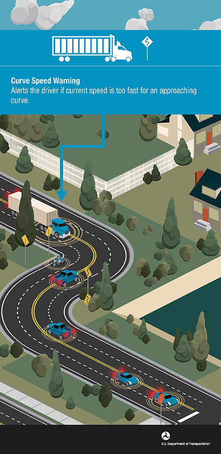
via USDOT/ITS JPO
The USDOT’s connected vehicle program has identified many safety applications and here is an important one – curve speed warning. This application warns a truck driver if the truck is traveling too fast for an approaching curve and potentially avoid a rollover. To learn more about connected vehicles click here.
August 20, 2014 at 5:01 pm
via PTV
Did you know that for every 1km/h reduction in average speed, there is a 2% reduction in the number of crashes? With the growing population of humans and vehicles globally, the safety of road users is becoming more and more important. The 2013 World Health Organization (WHO) report indicates that worldwide the total number of road traffic deaths is ~1.24 million per year. Only 28 countries, covering 7% of the world’s population, have comprehensive road safety laws on five key risk factors: drinking and driving, speeding, and failing to use motorcycle helmets, seat-belts, and child restraints. What’s more scary is the fact that this number is going to rise sharply – 1.9 million fatalities /year by 2020 if we don’t take any action.
So, how do we achieve a better safety record for the rest of the 93% global population? How do we build communities where every one can access the transportation infrastructure safely? One of the easiest ways to reduce the number of crashes is by reducing the speed of vehicles, which can have immediate and direct impact on the number of crashes according to this infograph from PTV. If you want to learn more about road safety, download PTV’s free white paper and register to participate in webinars on this topic in early September.

Image Courtesy: PTV Group Traffic Inside
February 4, 2014 at 5:26 pm

An awesome biking infographic from the team at Quicken Loans.
December 16, 2013 at 6:04 pm
Image via Barrington Freight
Also, who knew that one can be fined for driving a dirty car in Russia? Oh well, there are so many such crazy driving laws around the world and Barrington Freight got 50 of them in one awesome infograph.. Check it out

Image Courtesy: Barrington Freight via Huffington Post
April 24, 2013 at 8:09 pm
Image courtesy: CarScoops.com
This neat infograph landed in my inbox today.. It offers an interesting roundup of headlight regulations/requirements for states across the U.S. If you are planning a road trip across the country at some point in time, you might as well add this to your list of driving tools.
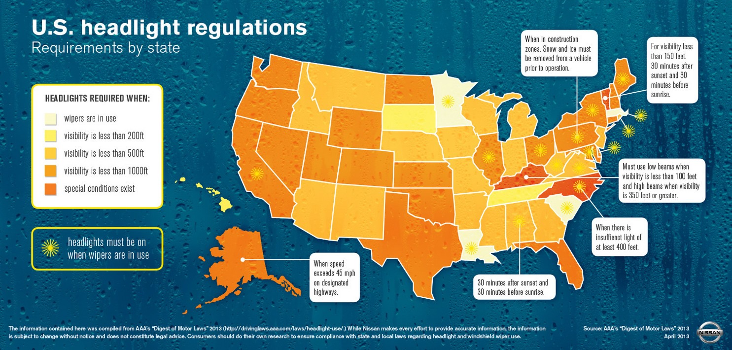
Image Courtesy: Nissan via CarScoops
October 19, 2012 at 3:17 pm
(via Nationwide)
To put it in simple terms, we blow up a lot of money sitting in traffic day in and day out. Traffic congestion not only takes a toll on your mental & physical well being, but it also brings home a lot of economic pain. It is nice to see someone layout all this important statistics in an easy to understand, colorful visual.
So, how do we fix this mess? A good start would be to move towards transit-oriented development and provide good, cost-effective transit connectivity to the suburbs.. And add some bike lanes; etc, etc. The solutions are plenty but we have to start somewhere before we go bankrupt.. soon!
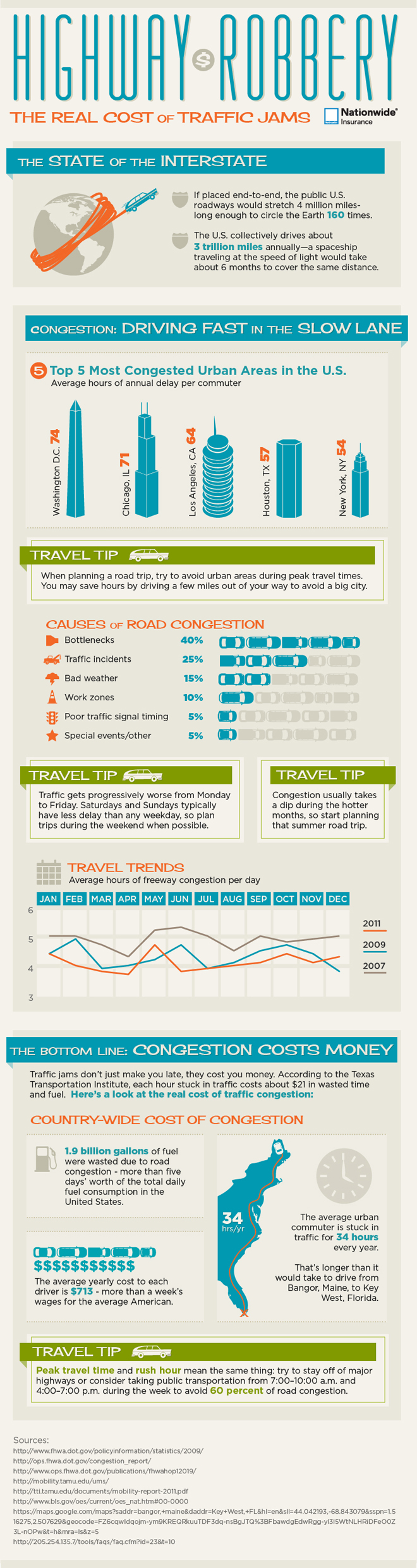
Provided by Nationwide Insurance


")
